Happy name day: the greeting card that finds you by a saint's calendar, drawn by a man who hated it
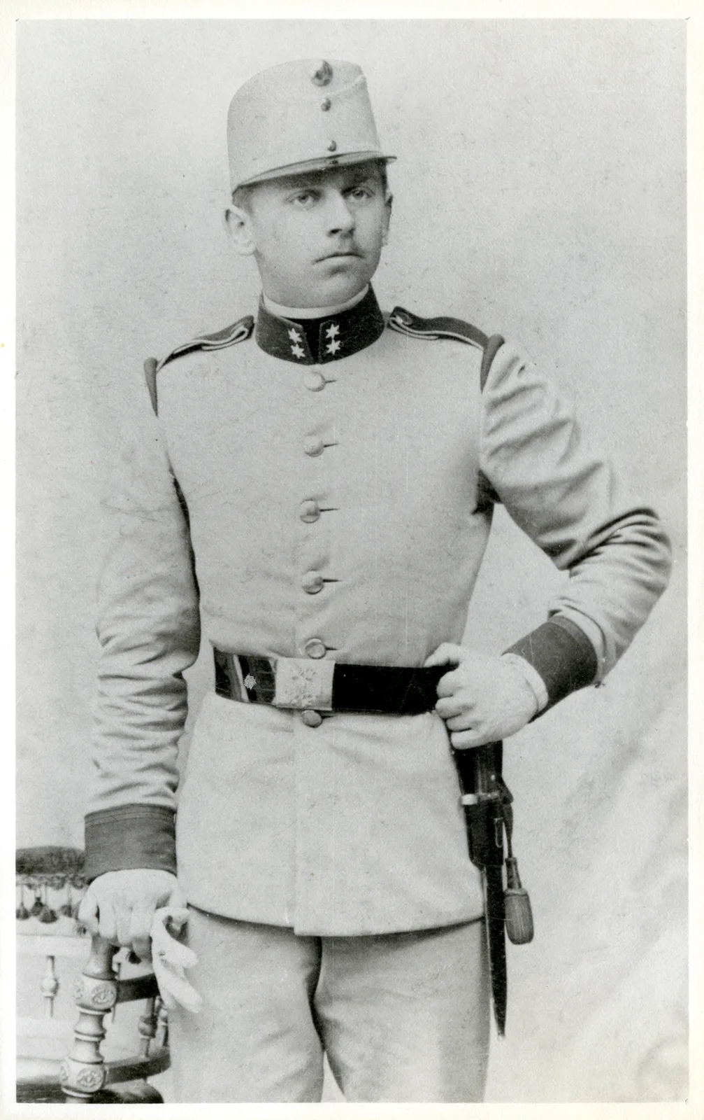
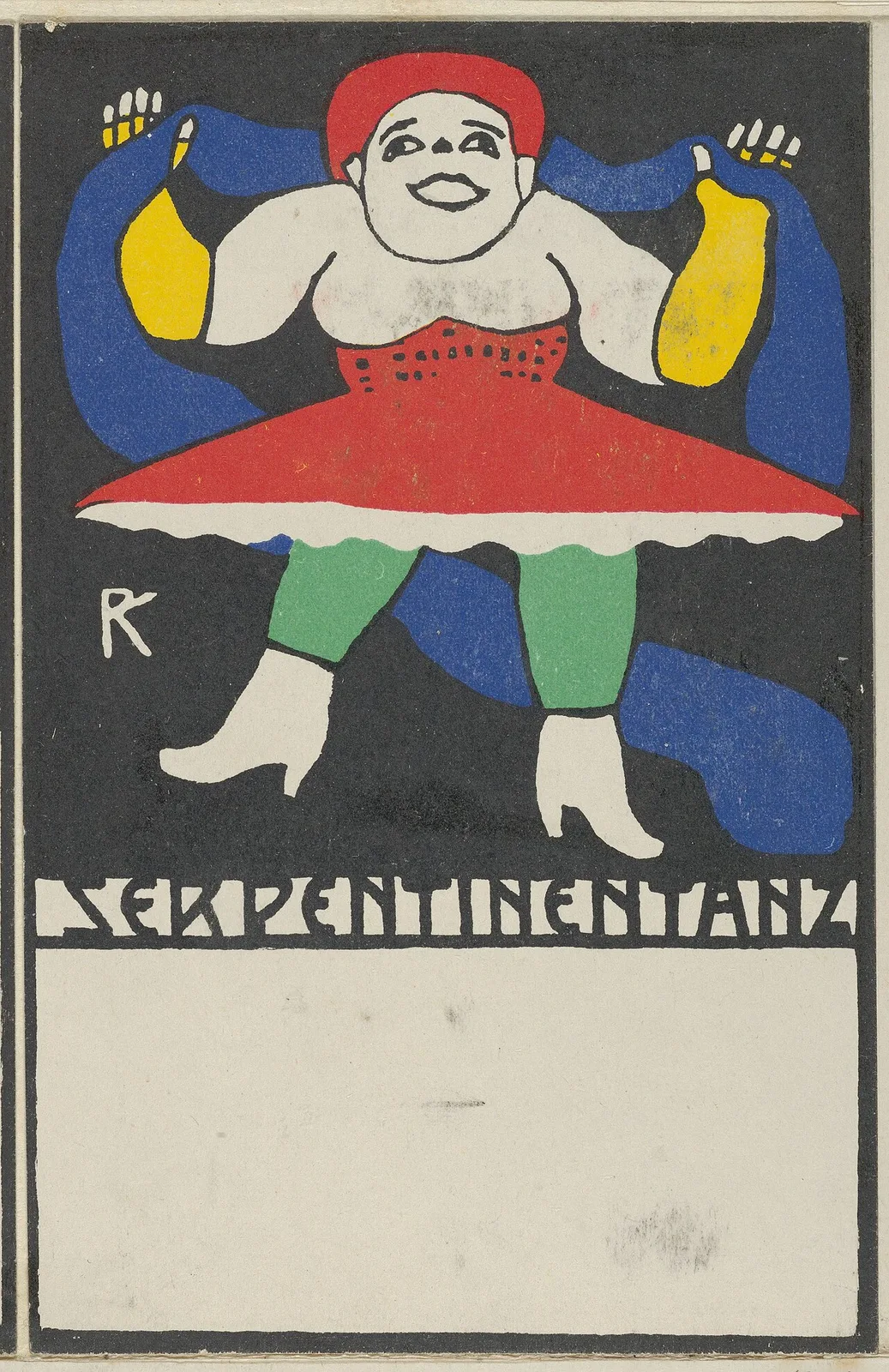
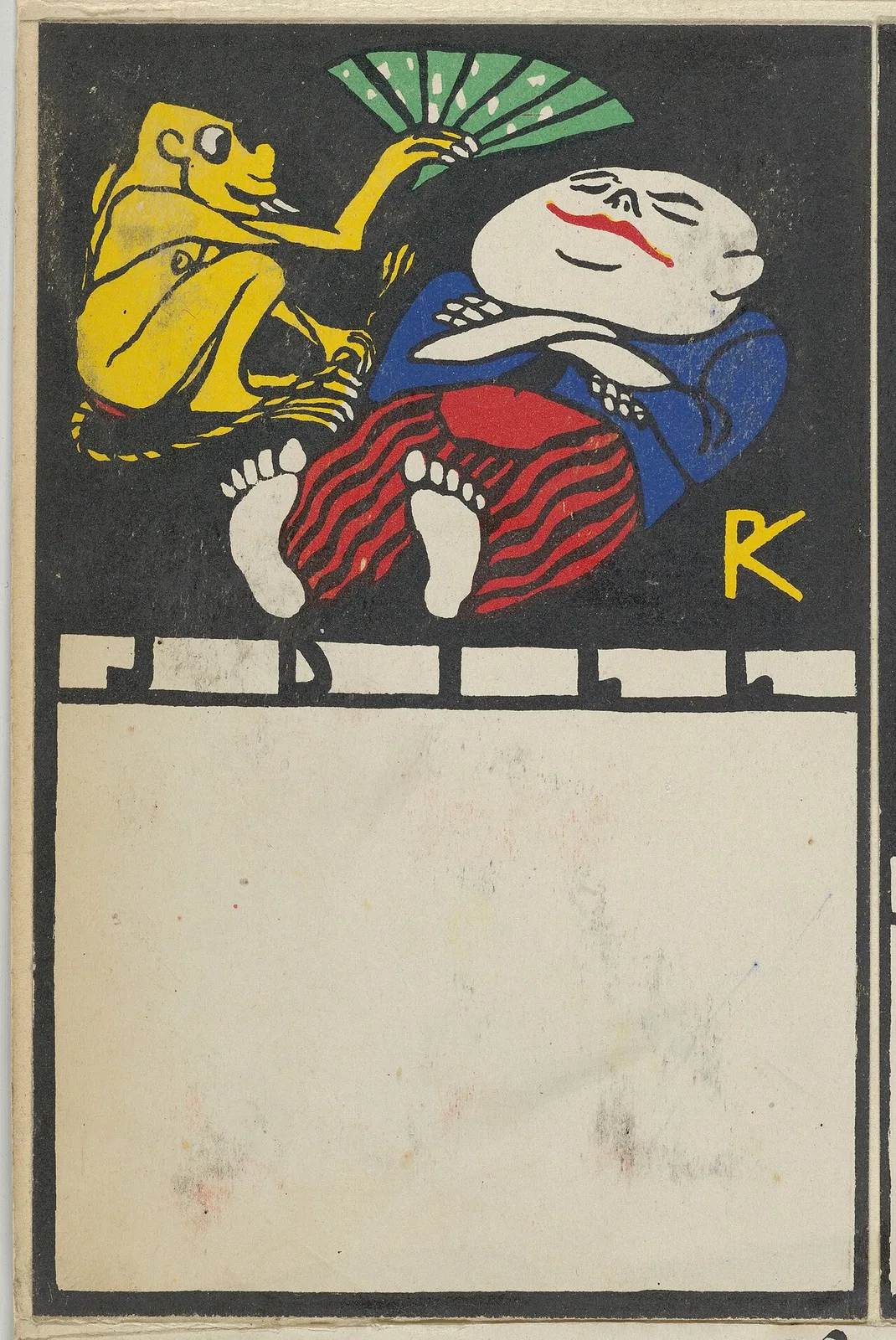
A name day is the feast day of the saint you are named for, and in much of Catholic and Orthodox Europe it is celebrated much like a birthday. So a card printed "happy name day" is addressed by the church calendar rather than the birth register: the printed occasion at the top is what routes it, the way a heading on a card catalogue drawer routes a searcher. In 1907, the year the Wiener Werkstätte's publishing arm opened, a young Viennese graphic designer named Rudolf Kalvach drew one of these straight, flower-laden ladies and gentlemen and all, folksy as anything. Then he spent the rest of his twenty-one cards undermining the form he was filling in.
The Wiener Werkstätte, or Vienna Workshop, was the design collective of the Vienna Secession, and it ran on the idea of the Gesamtkunstwerk, the total work of art: every corner of daily life, from a silver tea service to a visiting card tray, made aesthetic. Postcards were part of that programme, printed in high-end lithography, woodcut and pochoir, which is a stencil-based method of laying down colour. Between 1907 and the start of the First World War the Workshop's own press issued nearly a thousand postcard designs, with contributors ranging from Egon Schiele and Oskar Kokoschka to the satirist Moriz Jung. Kalvach, trained in Vienna and working in Trieste, was hired for the launch and made twenty-one of them before catatonic schizophrenia led to his institutionalisation in 1912, ending his career.
An occasion heading on a card does two jobs at once. It files the card in the shop (birthday, name day, condolence) and it files the recipient in a calendar, which is why a name day card can reach someone whose birth date you have never known. It is a retrieval key disguised as sentiment. Kalvach kept the key and changed the contents. The Public Domain Review's collection text puts it plainly: "Most, however, make a mockery of the greeting card's sentimentality."
The sharpest examples are the family ones. Primary colours on black grounds, heavy woodcut lines, long-legged monsters: the label on the drawer stays the same and the drawer is full of something else.
I like these because they make visible what every printed form does quietly. A heading is an editorial decision about who will be found and by what route, and a heading can be honoured while its promise is broken. Whether the buyers in 1907 read them as satire or simply as the modern style is not something the collection text settles, and it would take sales records or contemporary reviews to know. What is certain is that each card still announces its occasion in the language of the stationer's rack, and then hands you a mother who looks like she is drowning.